Captivate Your Audience: Explore Different Brochure Examples for Impactful Marketing

Brochures, those handy informational pamphlets, are a tried-and-true marketing tool. But with so many different brochure examples available, choosing the right one can feel overwhelming. Fear not, young entrepreneur! This guide will unravel the mysteries of brochure formats, empowering you to create impactful marketing materials that captivate your audience.
Why Choose the Right Brochure Format?
Imagine walking into a store filled with colorful candy, each offering a unique taste and experience. Choosing a brochure format is similar. Each format caters to specific content and visual presentation needs, influencing how your message is received. Selecting the right format ensures your message is delivered effectively and resonates with your target audience.
Unveiling the Popular Brochure Examples :
Now, let’s dive into the exciting world of Brochure Examples!
-
The Classic Bi-Fold: This is the simplest and most popular format. Think of a business card that folds in half. Bi-folds offer limited space but are perfect for quick introductions to your business, product, or service.
-
The Versatile Tri-Fold: Imagine a bi-fold with an additional panel. This format provides more space for showcasing features, benefits, and contact information. Tri-folds are ideal for showcasing products, services, or events with a bit more complexity.
-
The Engaging Z-Fold: Picture three panels folded in alternating directions, resembling a zig-zag. Z-folds are excellent for displaying sequential information or timelines. They also offer a unique visual appeal, making them stand out from the crowd.
-
The Panoramic Gate Fold: This format features a single central panel that folds outwards, creating a wider viewing area. Gate folds are perfect for showcasing stunning visuals like landscapes, product photos, or infographics.
-
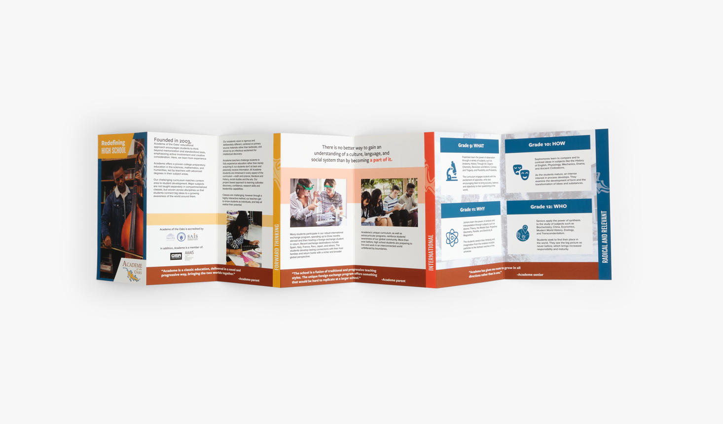
The Interactive Accordion Fold: Imagine a mini accordion! This format features multiple panels connected like an accordion, allowing viewers to unfold each section for detailed information. Accordion folds are ideal for presenting complex information in a neat and organized way.
Choosing the Perfect Brochure Examples:
Now that you’ve met the brochure format crew, how do you pick the perfect one for your needs? Consider these factors:
- Content Volume: How much information do you need to present? Bi-folds work best for concise messages, while accordion folds excel at handling comprehensive details.
- Target Audience: Who are you trying to reach? Younger audiences might respond well to unique formats like gate folds, while professional settings might favor classic bi-folds or tri-folds.
- Design Goals: Do you want to showcase stunning visuals or prioritize clear, concise information? Gate folds and accordion folds cater well to visuals, while bi-folds and tri-folds prioritize clarity.
Bonus Tip: Consider Online Brochures!
In today’s digital age, don’t forget the power of online brochures. These interactive versions can be embedded in websites or shared through email, offering a cost-effective and eco-friendly way to reach your audience.
Remember, the best brochure format is the one that effectively conveys your message and resonates with your target audience. So, explore your options, experiment creatively, and design brochures that truly captivate your audience!
Frequently Asked Questions (FAQs) about Brochure Examples
1. How can I make my brochure more interactive?
- Include QR codes: QR codes can link viewers to your website, social media pages, or even videos for a more engaging experience.
- Use touch elements: Consider using textured paper, embossing, or other tactile elements to spark curiosity and encourage interaction.
- Create a call to action: Tell your viewers what you want them to do next, whether it’s visiting your website, contacting you, or attending an event.
2. Where can I find online brochure templates?
Several websites offer free or paid brochure templates, including La Print Center,Canva, Microsoft Word, and Google Slides. These templates provide a starting point and can help you create professional-looking brochures even without design experience.
3. When should I consider using an online brochure instead of a printed one?
- Targeting a wider audience: Online Brochure Examples can be easily shared electronically, reaching a broader audience compared to printed versions.
- Cost-effectiveness: Online brochures eliminate printing and distribution costs, making them a budget-friendly option.
- Environmentally friendly: Opting for online brochures reduces paper waste and contributes to a greener marketing strategy.
